
The Pop Art Foundation: Origins, Principles, and Spatial Translation
Pop Art started taking shape after World War II when artists decided to move away from abstract expressionism. Instead they turned their attention toward things people saw every day in magazines, ads, and stores. The style grabbed ordinary images and transformed them through bright primary colors, simple graphics, and a kind of detached humor. Artists such as Andy Warhol with his Campbell's Soup cans, Roy Lichtenstein copying comic book panels, and Claes Oldenburg making giant soft sculptures all challenged what counted as real art. These creators didn't just make copies though; they forced everyone to think differently about who gets credit for art, what makes something original, and how much value we place on different works.
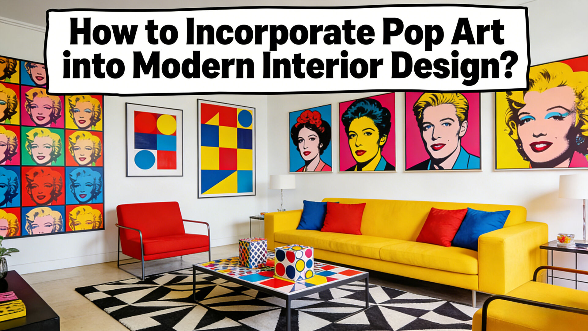
Interior design benefits from these ideas in interesting ways, though not through direct copying but rather creative adaptation. Many designers tap into Pop Art's bold colors and clear compositions to make striking focal points in modern interiors. Pop Art doesn't have to clash with minimalist designs either. Think of it as adding punctuation to a clean space. An accent wall inspired by Warhol's work, maybe a sculpture that channels Lichtenstein's style, or even a retro comic strip patterned rug can bring energy without disturbing the overall tranquility of a room. These touches work surprisingly well when placed thoughtfully.
Key spatial applications include:
- Color blocking, using saturated hues against neutral backdrops to define zones without clutter
- Graphic repetition, embedding iconic motifs—dots, Ben-Day patterns, speech bubbles—into textiles, wallpaper, or tile
- Juxtaposition, pairing organic forms (e.g., curved sofas) with hard-edged pop geometry (e.g., angular shelving or framed silkscreens)
This approach grounds modern interiors in art-historical relevance while preserving functional elegance. Pop Art’s democratic ethos—treating commercial aesthetics with the seriousness of fine art—continues to inform accessible, conceptually grounded design solutions today.
Strategic Integration: Balancing Pop Art with Modern Minimalism
The balance we see when combining the wild energy of Pop Art with the calm of minimalism doesn't come from settling somewhere in the middle, but rather through careful selection. Start with something simple for the background. Soft grey walls work great, or maybe warm white if that feels better. Matte beige is another good option too. These colors create a clean backdrop similar to what galleries use, so nothing competes visually and those striking artworks can really stand out. When adding Pop Art pieces, do it thoughtfully. Maybe just one or two standout items per space would be enough. Leave plenty of empty areas around them. This approach keeps things from getting overwhelming while still letting those eye-catching pieces shine. Think about how a vibrant comic book style painting or that shiny red sculpture suddenly becomes the star of the room when given proper breathing room.
| Integration Principle | Minimalist Application | Pop Art Enhancement |
|---|---|---|
| Color Strategy | Monochromatic furniture palette | Accent hues pulled directly from artwork to unify composition |
| Spatial Balance | Clean-lined, low-profile furnishings | Strategic placement on feature walls or recessed niches to amplify presence |
| Texture Contrast | Smooth, reflective surfaces (glass, polished metal, lacquered wood) | Tactile mixed-media pieces—screen-printed panels, enamel-coated steel, or vinyl-clad sculptures |
Getting the right mix matters a lot. Think about placing a colorful Warhol print over a sleek modern sofa to create interesting contrast without making the space feel crowded. If this whole Pop Art thing feels intimidating at first, start small. Add some subtle touches instead of going all out with big pieces. Ceramic vases that have those cool half-tone glazes work great. Throw pillows with Ben-Day dot patterns are another good option, or maybe pick up a lamp that looks like something from the 60s but still functions well today. Size definitely counts when arranging these items. Big artworks look fantastic in spacious living rooms where they can really stand out. Meanwhile, smaller framed prints or decorative sculptures bring life to tight spaces like home offices or hallways without taking over completely.
Color and Contrast: Applying Pop Art’s Chromatic Language Thoughtfully
What makes Pop Art so visually striking is its bold use of bright primary colors like electric blue, fiery red, and sunny yellow, combined with strong contrasts that usually include black and white elements. Artists didn't pick these colors randomly. Take Warhol's famous Campbell's Soup cans for instance—they used the exact same colors as the actual product so people would instantly recognize them. Lichtenstein went even further with his tiny Ben-Day dots that looked just like what comes out of a commercial printer, basically making fun of how machines reproduce art. When it comes to interior design, these color choices actually affect how we feel and behave. Red tends to get conversations going in dining rooms, while blue helps people concentrate better in their home offices. And let's face it, nobody sits around staring at blank walls when there's a cheerful yellow room nearby begging to spark some creative thinking.
To integrate such intensity without disrupting minimalist serenity, treat color structurally—not decoratively:
- Anchor with neutrals: Use white, warm gray, or oat-toned walls and cabinetry as a consistent base
- Strategic saturation: Confine intense hues to 20–30% of the room’s visual weight—via a single statement chair, framed print, or custom-tiled backsplash
- Complementary pairing: Amplify energy with purposeful duos—orange and teal in a midcentury-inspired lounge, or purple and mustard in a creative studio—grounded by shared tonal depth
- Ground with contrast: Introduce black-and-white graphic elements—halftone rugs, striped upholstery, or monochrome photo grids—to add sophistication and visual rhythm
This method honors Pop Art’s conceptual rigor while ensuring enduring harmony. When color functions as architecture—not ornament—it becomes both expressive and restful.
Curating Pop Art Focal Points: Scale, Placement, and Intentionality
Good curation turns Pop Art into something more than just wall decor—it becomes the story centerpiece. Size really matters when it comes to how people see art. Big canvases grab attention in those lofty entrance halls or spacious living areas where there's plenty of room for drama. Smaller works work wonders too, bringing life to cozy corners like book reading spots or narrow hallways. Putting giant art in small rooms feels overwhelming though, while tiny pieces get lost on large walls. Most professionals suggest going for artwork that takes up around two thirds to three quarters of the wall space horizontally. And hanging height? Aim for roughly eye level, which is typically between 57 and 60 inches off the ground. This matches where most folks naturally look when entering a space, making the art feel more welcoming and balanced overall.
Placement shapes engagement: dominant works belong on primary walls visible from key circulation paths—entryways, hallways, and seating zones—never tucked into corners or beneath low ceilings where impact dissipates. Complementary lighting—focused track spots or adjustable picture lights—enhances pigment vibrancy and texture without glare or hotspots.
What makes good design stand out from just looking nice? It's all about intention. When putting together a space, focus on creating themes that work together instead of mixing random styles. Think about pieces that talk to each other artistically. For instance, place Warhol's repetitive consumer goods next to Oldenburg's giant food sculptures, or put Lichtenstein's comic book panels beside Rosenquist's broken-up ad images. Rotating artwork throughout seasons keeps things fresh without losing the overall message behind the collection. According to a recent study published in Art & Design Quarterly last year, around three quarters of really successful interior designs stick to consistent concepts rather than trying to pack in too many different visual elements at once.
Before finalizing placement, ask:
- Does this piece anchor or extend the room’s existing color story?
- Is its cultural or historical context meaningfully resonant with the space’s function or identity?
- Does it coexist with adjacent negative space—not merely fit within it?
Purposeful curation ensures every Pop Art element delivers layered aesthetic, emotional, and intellectual resonance.
FAQ Section
What is Pop Art?
Pop Art is an art movement that emerged post-World War II, emphasizing everyday, recognizable imagery through bright colors, simple graphics, and humor. Artists challenged norms by highlighting how art can be accessible and engaging without being traditionally serious or elitist.
How does Pop Art influence interior design?
Pop Art influences interior design by adding vibrant colors and bold compositions, creating striking focal points in modern interiors. It can be integrated thoughtfully to complement minimalist designs, adding energy and personality without overwhelming the space.
What are some key principles for integrating Pop Art into a minimalist interior?
Key principles include strategic placement of bold art pieces, using color blocking and graphic elements discreetly, and ensuring a spacious balance between art and minimalist furnishings for visual harmony.
How can Pop Art colors affect an interior space?
Pop Art colors like bright reds, blues, and yellows can enhance moods and interactions and even influence behaviors. For example, reds can energize dining spaces, whereas blues may aid concentration in home offices.
What factors should be considered when curating Pop Art within a room?
Consider scale, placement, lighting, and thematic consistency. Ensure art pieces align with the room's existing color story, cultural relevance, and spatial layout to enhance intentional design and create a cohesive narrative.